


Project Estimator
Get Instant Quote
Avoid budget disasters – get a clear Responsive design estimate now!
Don’t leave your project budget to chance. Our intelligent project estimator asks the right question to give you an accurate quote in minutes, not weeks.
Start Free Estimate
No commitment required
Get results instantly
100% confidential
Why Responsive & Mobile‑First Designs?
Your website must look and function perfectly across all devices, or you risk losing visitors. People no longer browse on desktops; they tap, scroll, and shop on their mobile devices, which is why mobile-first designs are a must.

- Over 60% of global web traffic comes from smartphones and tablets.
- Mobile‑first indexing makes responsive design essential for SEO: Google ranks your mobile version first.
- Non‑optimized mobile sites frustrate users and cut conversions by up to 61%.
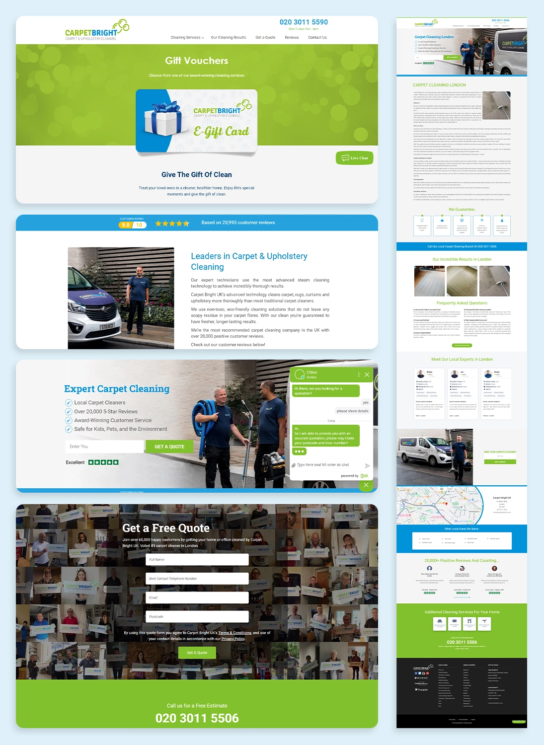
Services Offered

Custom Layout Design
Simplified, touch‑friendly layouts that adapt using fluid grids, CSS media queries, and flexible images so no pinch‑zoom needed.

Performance Optimization
Fast‑loading pages via image compression, lazy loading, cleaner code, and caching, decreasing bounce rate and improving core web vitals.

Touch-Friendly Navigation
Buttons, links, and menus sized & spaced for easy tap navigation, designed for thumbs to enhance usability and engagement.

Analytics & Accessibility
Integrating tools to track how users interact with your mobile pages—helping refine the design for maximum impact.
The Dynamologic Advantage

CLIENT-CENTRIC DESIGN
We start with your mobile users in mind, from the first wireframe, ensuring clarity, focus, and a conversion-first experience.

USER TESTING INSIGHTS
We run real-device usability tests and refine navigation flow and CTA placement, minimizing friction and maximizing ROI.

LEAN, CLEAN CODE
Our developers code responsively from the ground up using best practices: fluid units, media queries, and scalable assets, reducing bugs and simplifying maintenance.

SCALABILE DESIGNS
Our designs naturally adapt to new screen sizes, future devices, and performance requirements, saving you tons of rework and extra cost as your business grows.
What You Get
- One responsive, mobile‑first design that works and converts on any device.
- Faster SEO results thanks to mobile‑friendly indexing and improved site speed.
- An accessible experience that builds trust, meets standards, and reaches broader audiences.
Other Highlights
- Dedicated UX design team experienced in responsive and mobile‑first best practices.
- Agile delivery for continuous improvements, updates, and fast turnaround.
- A performance‑first process tuned to reduce bugs, optimize conversion, and drive client satisfaction.
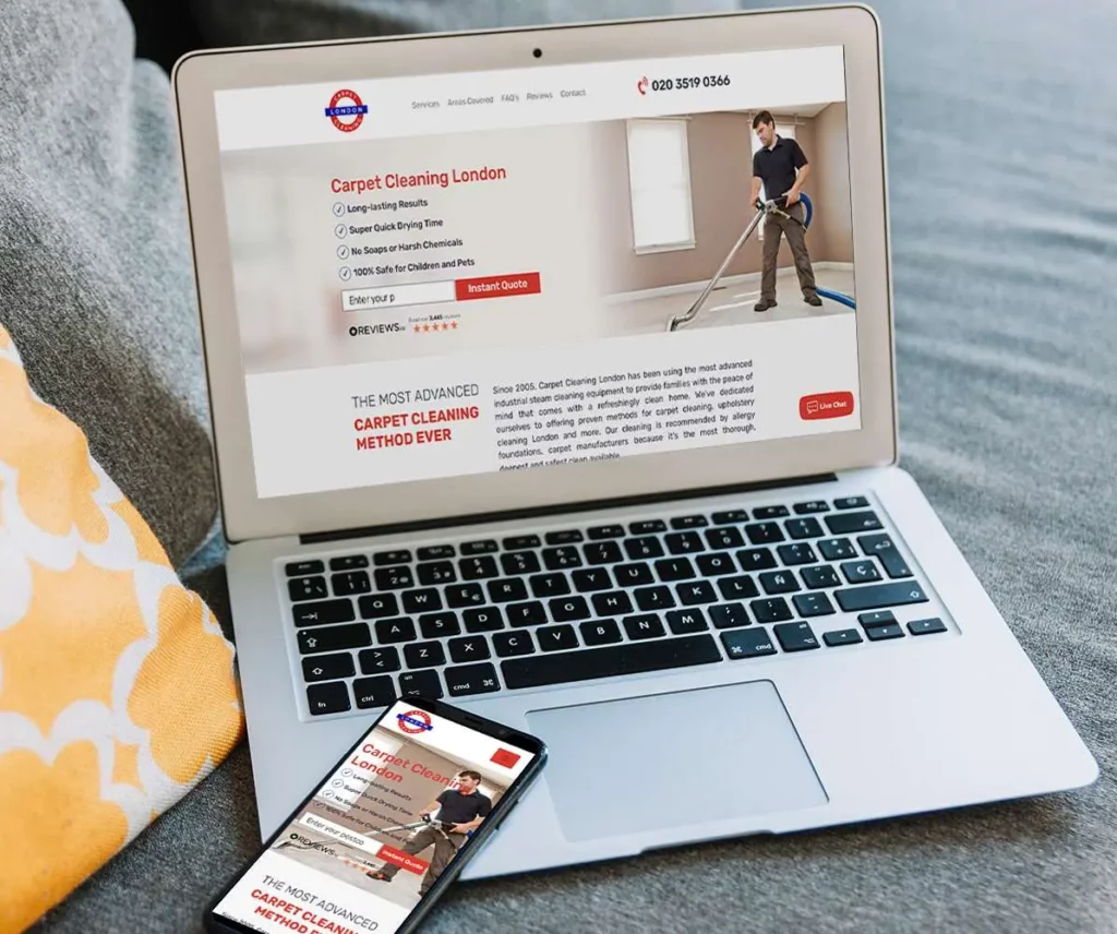
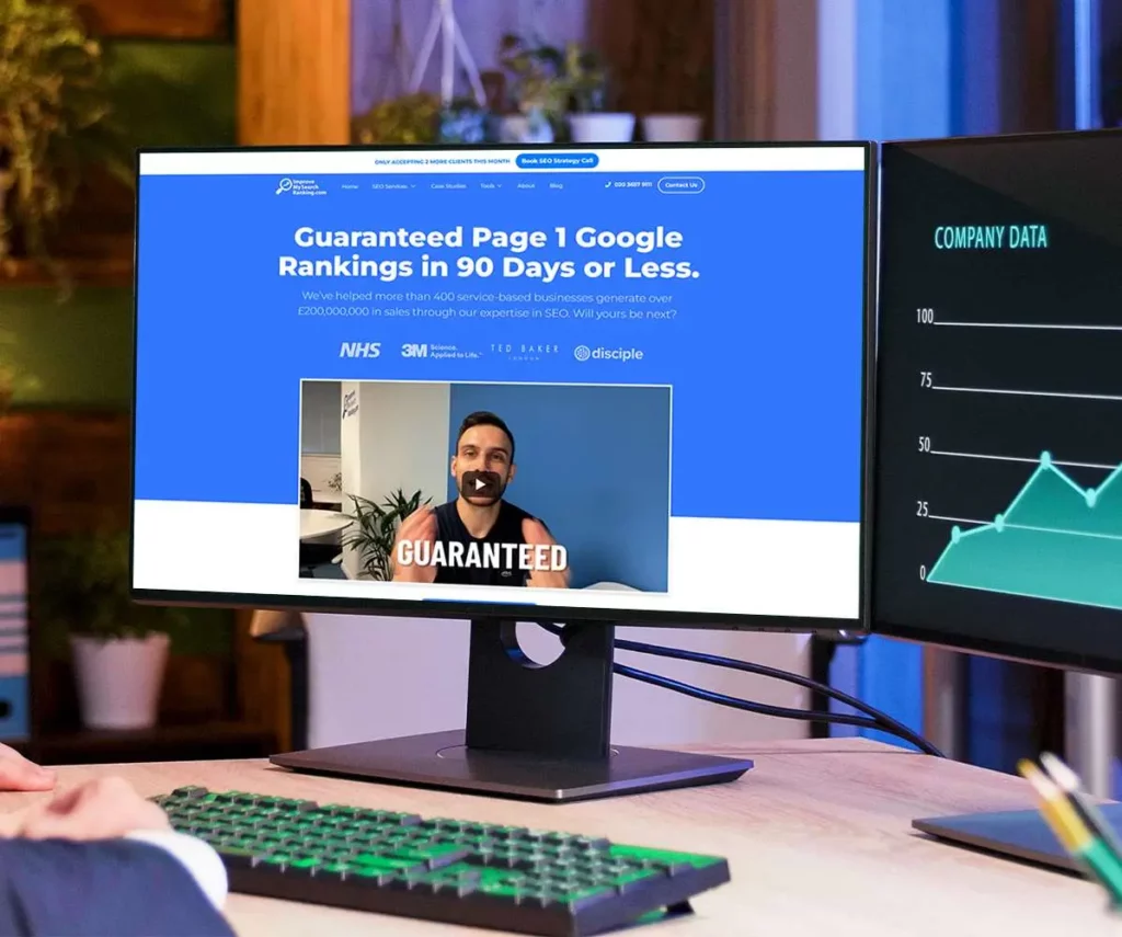
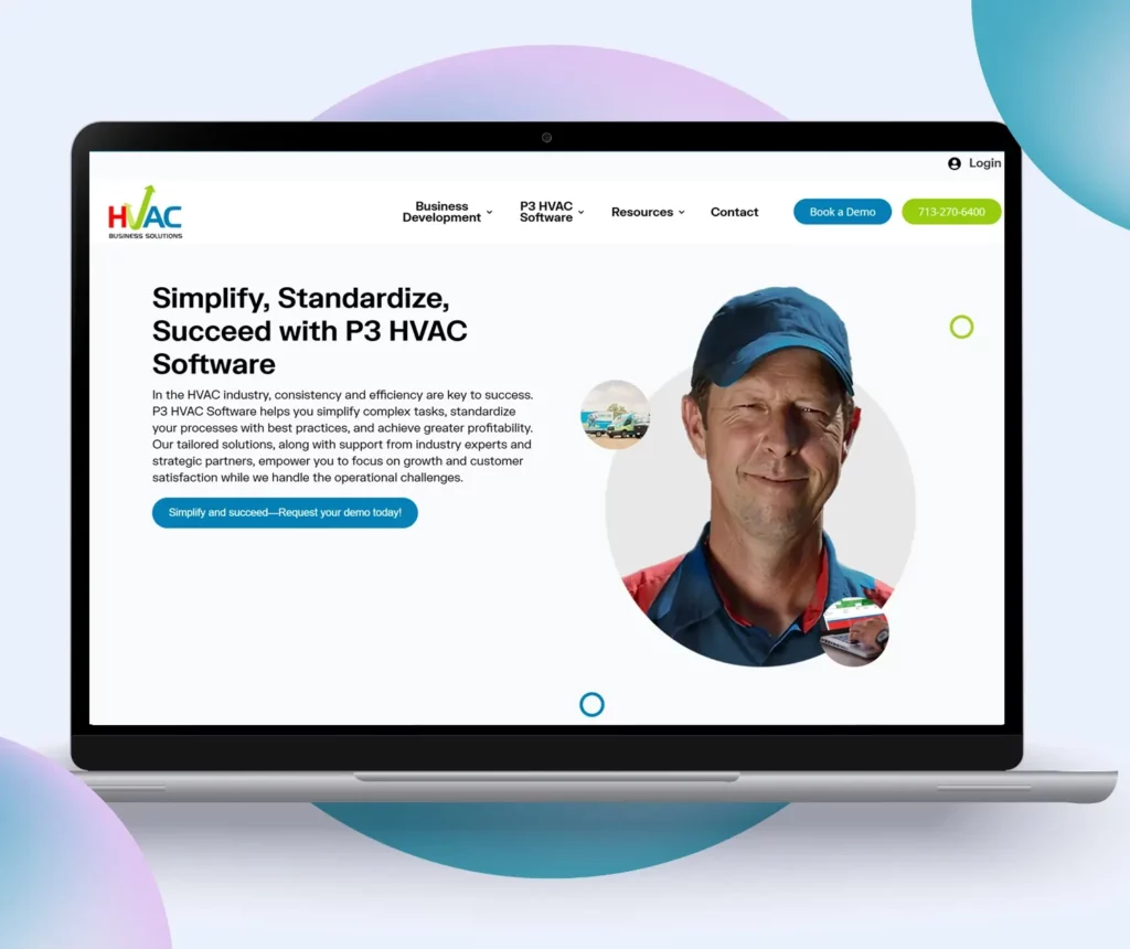
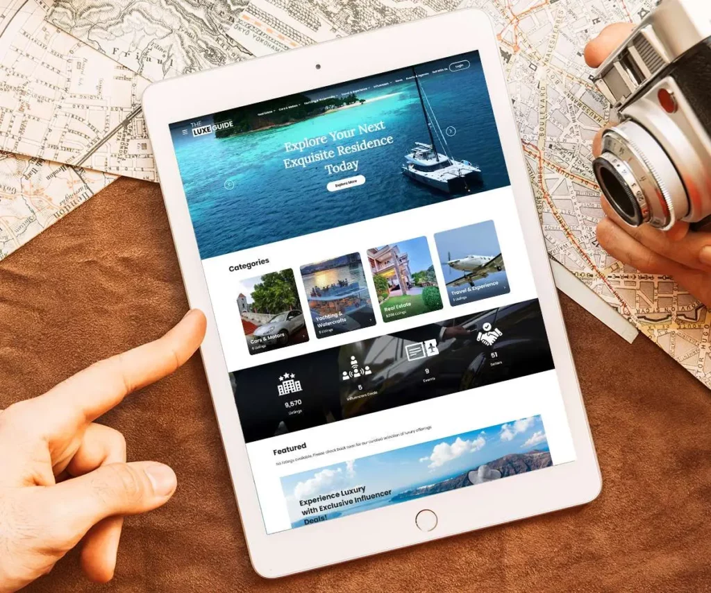
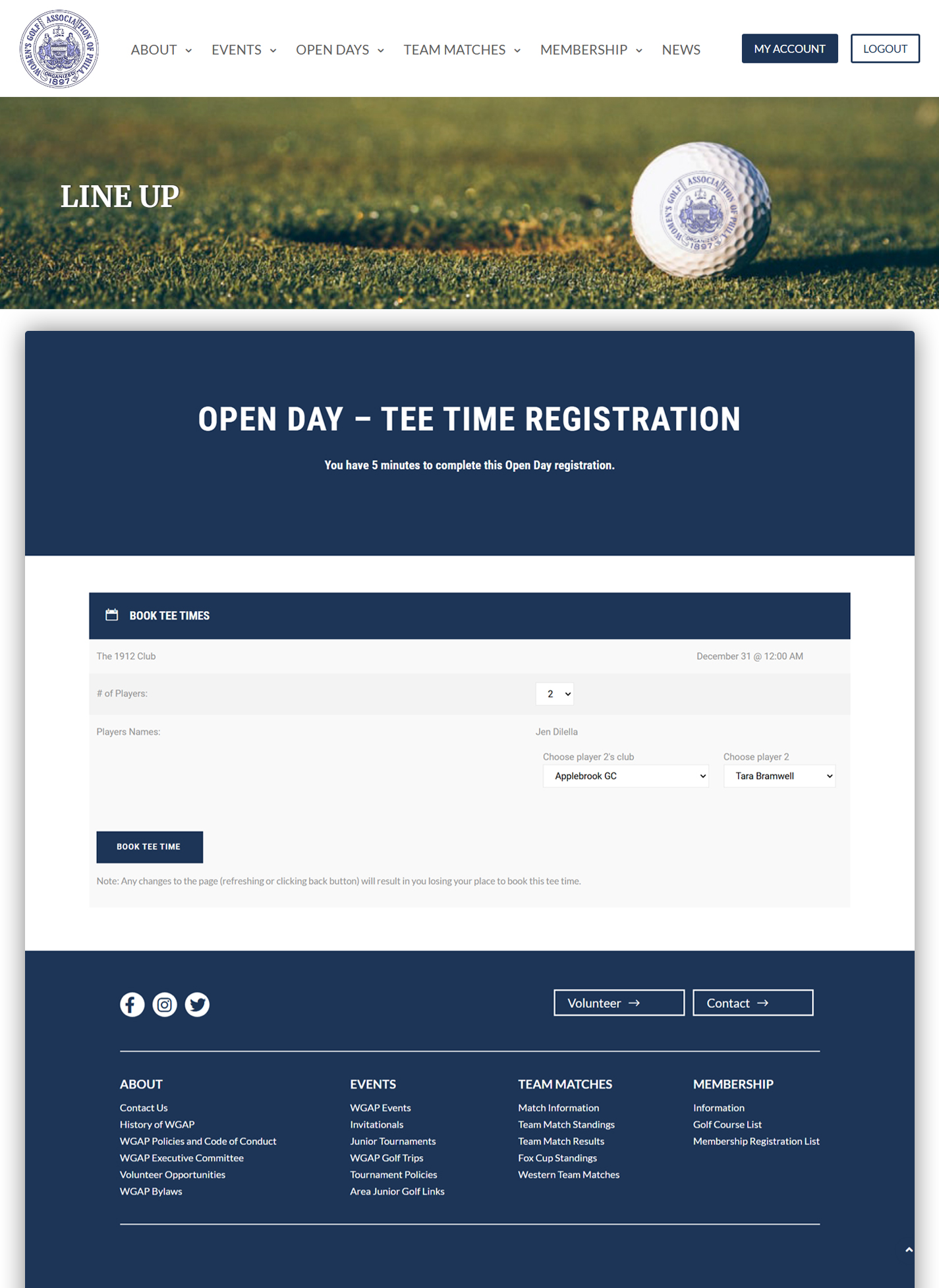
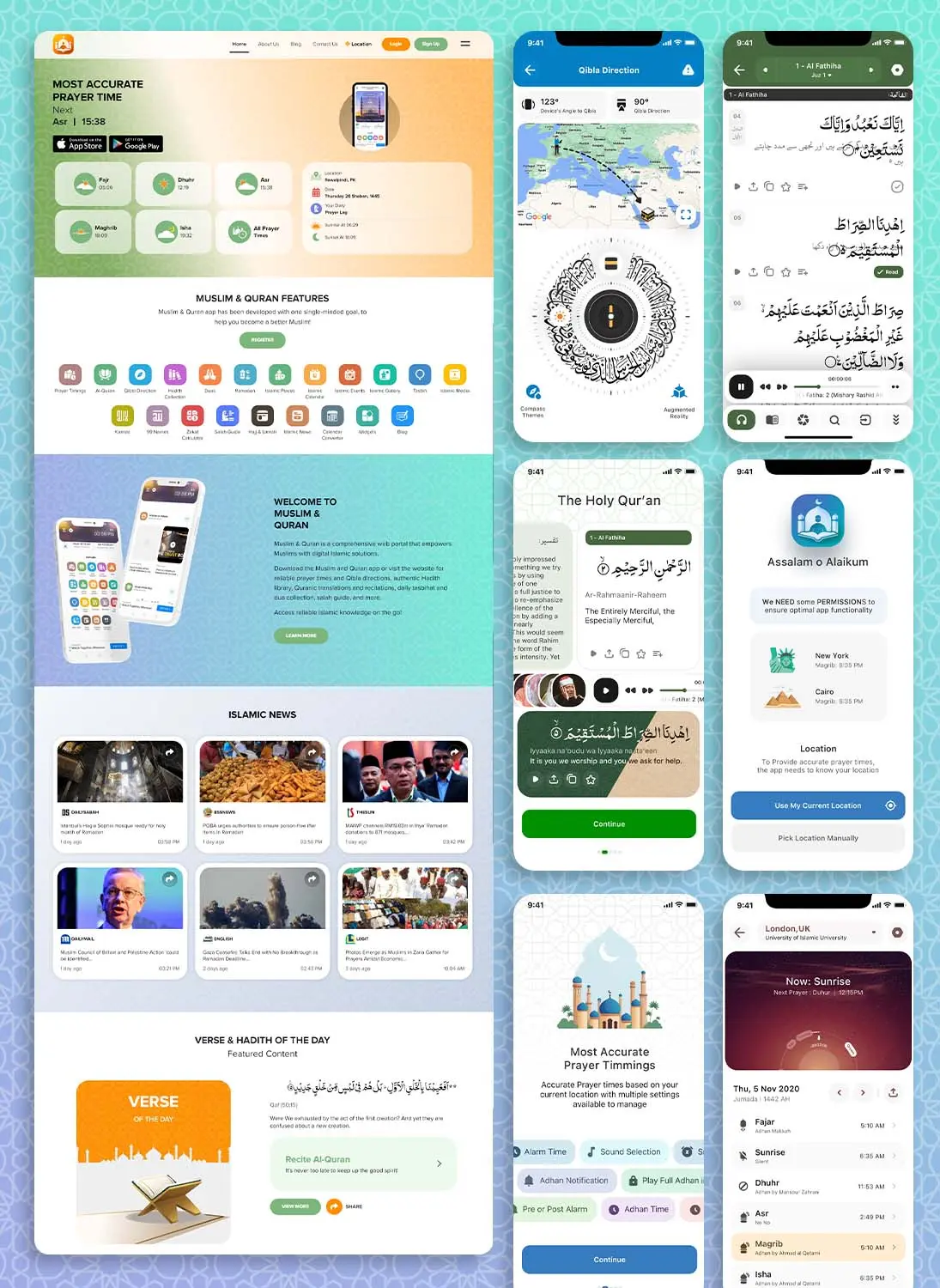
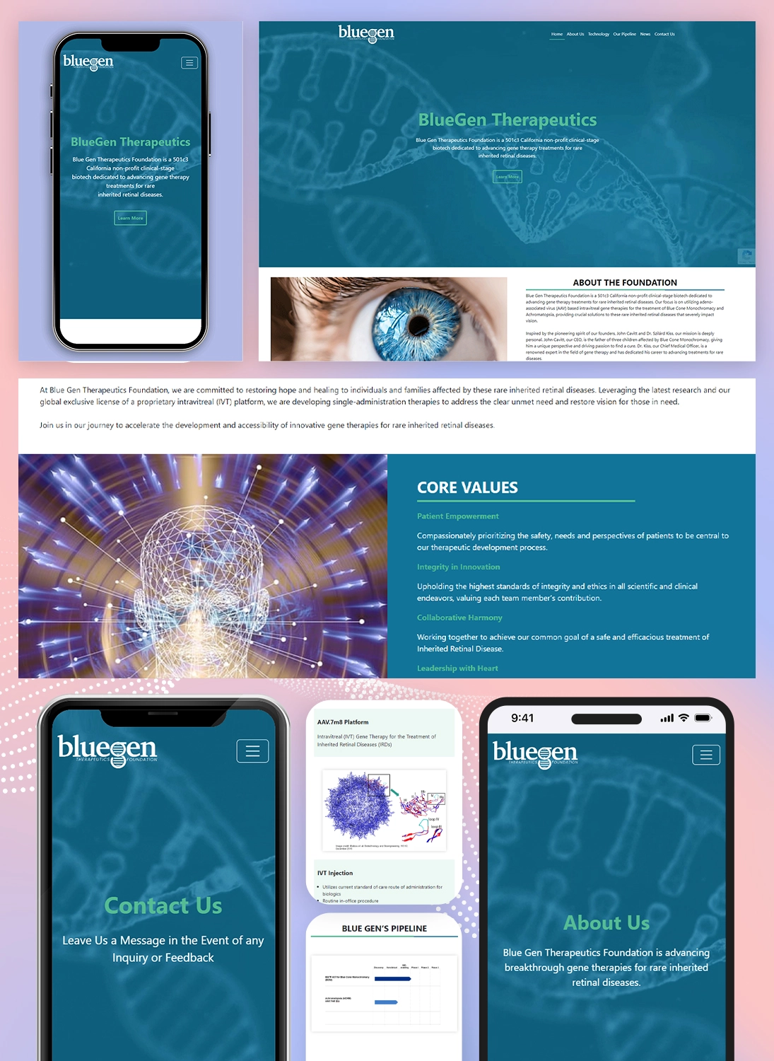
Our Work
The story of our company told through the success of our clients.
Industry Verticals We Service
Dynamologic Solutions has lent its expertise to a multitude of industry verticals over the past 10 years. In the past decade, we have built a strong and versatile clientele that spans 3 continents and 15 industry verticals. Our commitment to excellence, customer-focused approach, and cutting-edge solutions means that our customers keep choosing us again and again.
Case Studies
The case studies in this section have been handpicked to showcase our best design and development projects. Each case study shows how we used industry-leading practices to transform our client’s idea into a working project.
What Our Awesome Clients Say

Another excellent job. I have used DynamoLogic on several projects, and they continue to impress each and every time.
We had the pleasure of working with DynamoLogic, and they truly went above and beyond our expectations. The project manager's exceptional communication ensured we were always aligned, and he consistently delivered ahead of schedule without ...

The whole team at DynamoLogic is truly outstanding. From their responsiveness and the high quality of their work to their deep knowledge and competitive edge, working with them has been an excellent experience. I’m already collaborating with them on ...

It was a pleasure working with DynamoLogic. They are definitely experts at what they do. Patient. Persevering. Precise. Excellent work.

Have a project in mind?
Let’s talk about it.
Please fill the form below to get started.

Have a project in mind?
Let's talk about it.

© 2026 Dynamologic Solutions All rights reserved.